Design your Storefront Pages with Salesforce’s Page Designer Plus
Written by Poonam Chandersy
Technical Content WriterOn an average, for a first-time site user, to form an opinion of a website, it takes only about 0.05 seconds. It is in this short period that determines whether the user will stay or leave the website. If the webpage does not grab the ideal customer’s attention the moment they visit the page, it is most likely that they’ll take their business elsewhere.
Visitors judge your websites, and this judgment isn’t merely limited to the visual appeal of the website. In fact, it has a lot to do with how people perceive the brand.
That being the case, it is essential to make an appealing first impression of the website and focus on the layout, colours, text, fonts, spacing, and much more.
Hence, while making changes to web pages on-the-fly, – ones that can make or break a critical sale – time is of utmost importance. This is where Royal Cyber’s Page Designer PLUS for Salesforce Commerce Cloud plays an integral role.
Royal Cyber’s Page Designer PLUS for Salesforce Commerce Cloud helps developers and business users to create storefront page structures much more effortlessly. A good website helps to establish the brand credibility, broaden expanse, and generate leads.
Whether shuffling the homepage to promote a specific product line or even liquidating the product through an ad hoc campaign, Page Designer PLUS offers a visual editor to drag and drop design elements that enable dynamic changes, without any heavy coding involved. As Page Designer PLUS is being built on top of existing OOTB Salesforce Commerce Cloud Page Designer, hence, you get features of both i.e. OOTB Salesforce Page Designer and new Page Designer PLUS.
In this blog, we discuss how Royal Cyber’s Page Designer PLUS for Salesforce Commerce Cloud works, its benefits, limitations, and the different component types that makes it a unique designer visual editor.
What is Page Designer?
Page Designer is a page designer visual editor offered by Salesforce Commerce Cloud. This steadily built page designer allows developers to create and control content webpages in a sophisticated manner. It works with all the development tools and strategies to design reusable page and component types.
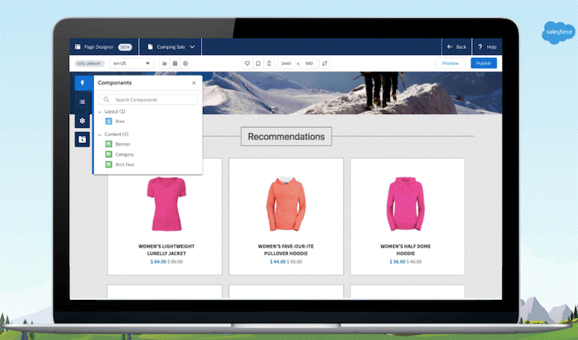
Out of the box as part of the product, that allows developers to quickly design static and dynamic page structures without getting into the storefront reference architecture. This is possible by using predefined, custom layouts and component types provided by the Page Designer visual editor. The developers can create, plan, and publish web pages in the storefront by using the drag and drop interface. Also, business users can create different web pages on their own using the same page and component types.
Salesforce also provides a sample plugin cartridge to demonstrate how to create custom component types and layouts. This cartridge allows the option to include custom functionality to the base cartridge. It is recommended to add the sample plugin cartridge to the left of the base cartridge to notice the functionality.
Salesforce Commerce Cloud Page Designer comes with lot of rich CMS features. At the same time, it also allows customization and personalization of component types to fulfil specific business’s needs.
The customization options empower developers to leverage the potential of the platform and extend the capabilities to create a storefront that delivers the right user experience.
The Page Designer follows the following steps for the implementation process.
- Identify the requirements such as the kind of web pages that need to be created, component layouts, and assets required for the storefront.
- Creation of reusable page types and component types that align with the requirements.
- Upload custom cartridge that includes all the web pages and component types. The other custom cartridge with the website's UI elements is also uploaded.
- The business owners use the Page Designer visual editor to create storefront pages by deploying the page and component types that the developers have implemented.

What’s new in Royal Cyber’s Page Designer PLUS for Salesforce Commerce Cloud?
Royal Cyber Page Designer PLUS comes with more rich DRAG & DROP widgets, developed on top of Out of the box Page Designer component types, helping developers to save a significant amount of time in creating similar UI component types with customized code. In addition, it enables the developers to create and deploy applications using enhanced features without worrying about development times and testing phases. Page Designer PLUS is built on top of existing Salesforce Commerce Cloud Page Designer and is available in the community repository.

Page Designer Plus Dependencies
Page Designer PLUS requires SFRA base cartridge and Page Designer plug-in module cartridge to be implemented. The SRFA architecture enables the developers to create mobile experiences at fast pace.
Since Page Designer PLUS is built on top of Page Designer plug-in cartridge, it allows reuse of some of its primary component types, preventing developers from reinventing the wheel and at the same time adds value. Page Designer PLUS cartridge contains new component types, along with some samples on how to extend the Product List Page layout. For example, you can use the following updated component types that are part of the Page Designer Plus visual editor:
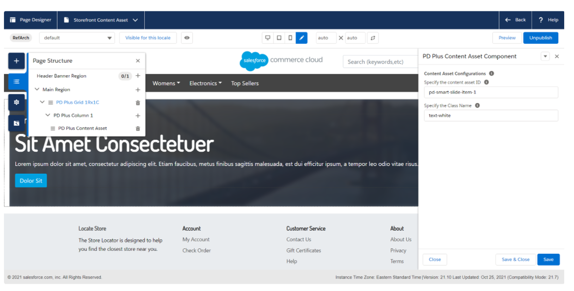
Content Asset Component
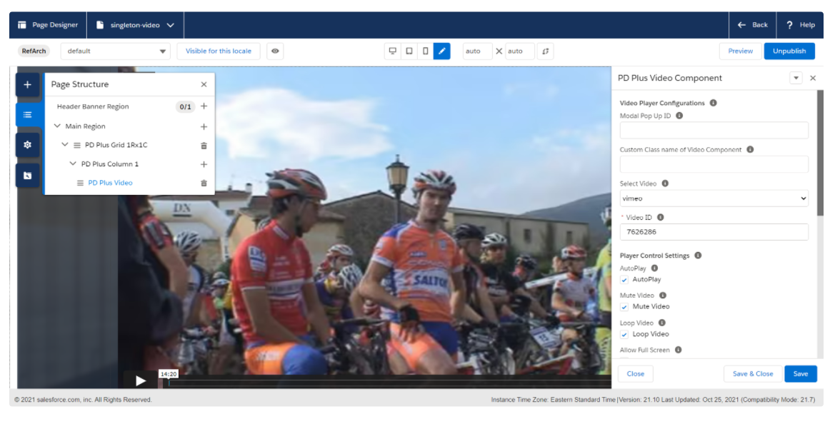
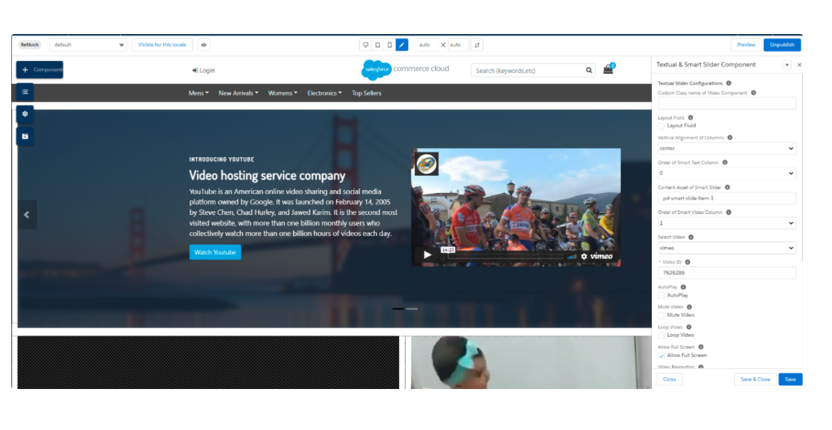
Extended Video Component
Extended Slider/Banner Component
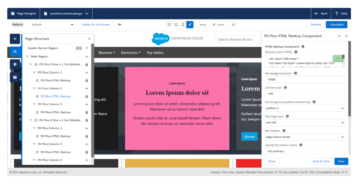
HTML Markup Component
Enhanced Marketing Tile
PLP Customization demo for refinement location
HTML Markup Component
The HTML Markup component is an easy-to-use component, allows developers to quickly embed HTML styled text with a custom background color and texture to any page. This feature helps save time to recreate similar HTML pages and allows developers to re-use the same component without going into the details of coding and styling. Some HTML Markup Component can control the following:
- Background Colour of Component
- Customizable Heading Text
- Customizable Sub-Text
- Control over Text Colour
- Control over Content Direction (Top-Left/Top-Centre/Top-Right/Centre-Centre/Centre-Right)
- Control over Text Alignment (Left/Right/Centre)
- Ability to choose from 16 built-in background patterns
- Ability to Add Button for External link
- Ability to Add Button for Internal Link to Content or Page
- Ability to Add Custom classes to publish different styles of bootstrap OOTB buttons
- Control over Text Alignment (Left/Right/Centre)
- Ability to choose from 16 built-in background patterns
- Ability to Add Button for External link
- Ability to Add Button for Internal Link to Content or Page
- Ability to Add Custom classes to display different styles of bootstrap OOTB buttons

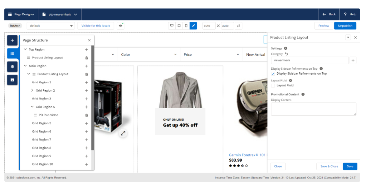
Enhanced Product List Page Component
Page Designer Plug-in provides sample templates for Product List Page layouts. It also allows limited customization options such as refinement locations and component types available that can be used in a product grid for marketing purposes. While, Page Designer PLUS Cartridge enhances the same template to make it configurable for businesses where the refinements are displayed on the top or the bottom of the page. With just one click, business users can control the location of the refinements on the page. Also, they can now add any Page Designer PLUS components such as Content Assets, Video Assets, or Marketing Tile Components to enhance the functionality, improve, and fulfill business’s needs. Key features of the PLP Page include:
- Ability to Show Refinements on a desired location of the page.
- Ability to Use standard and enhanced Page Designer components in the Grid. For example, Online Videos, videos in Modal popup, Extended Marketing tiles, and much more.
Let Us Help You Get Started
Do you have a business or intend to start one? Royal Cyber knows what it takes to create a business website with an everlasting impression. Our Salesforce certified experts deploy Salesforce Commerce Cloud’s Page Designer Plus to make easy and seamless changes to the website pages.
If you’re looking to get started with Page Designer Plus, we can help you learn to create and modify pages of your website instantly with the help of reusable page component types. Contact us to schedule a meeting and get started today!